︎
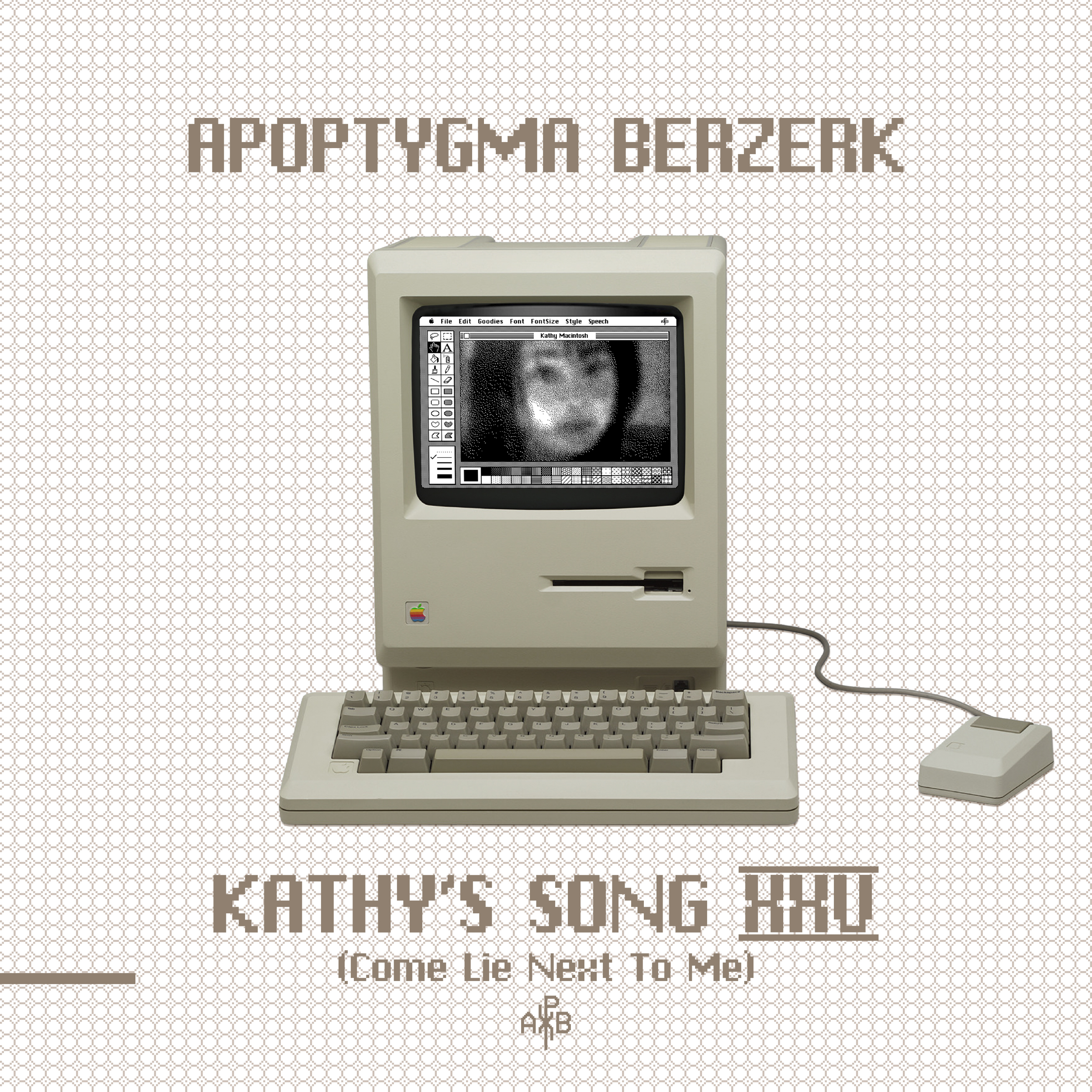

Kathy’s Song XXV
Kathy’s Song XXV digital release 22 December 2025
Original CD (2000) single and digital release to the right.
Design by Halvor Bodin
Kathy’s Song (Come Lie Next To Me)
(Ferry Corsten 2025 Remix – Radio Version) 03:56
Kathy’s Song (Come Lie Next To Me)
(Zone Tripper Remix) 08:17
Kathy’s Song (Come Lie Next To Me)
(Mental Overdrive Remix)05:24
Kathy’s Song (Single Version) 03:56
Vocal recording and mixing: Fredrik Darum
Mastering: Ole-Espen Kristiansen
Vocals: Kathy Macintosh
Programming and co-producer: Vegard Blomberg
Co-produced: Inge Nilsen
Co-Mixing engineer: Alexander Odden
Remixes by: Ferry Corsten, Zone Tripper and Mental Overdrive
℗ & © 2025 Pitch Black Drive
Pitch Black Drive on Bandcamp
THEAPBOFFICE.COM
lo-fi-merchandise.com
theelectricfox.com
2025
Cover for digital release
View all recent Apop projects.
View older Apop projects in the archive.
Cover for digital release
View all recent Apop projects.
View older Apop projects in the archive.


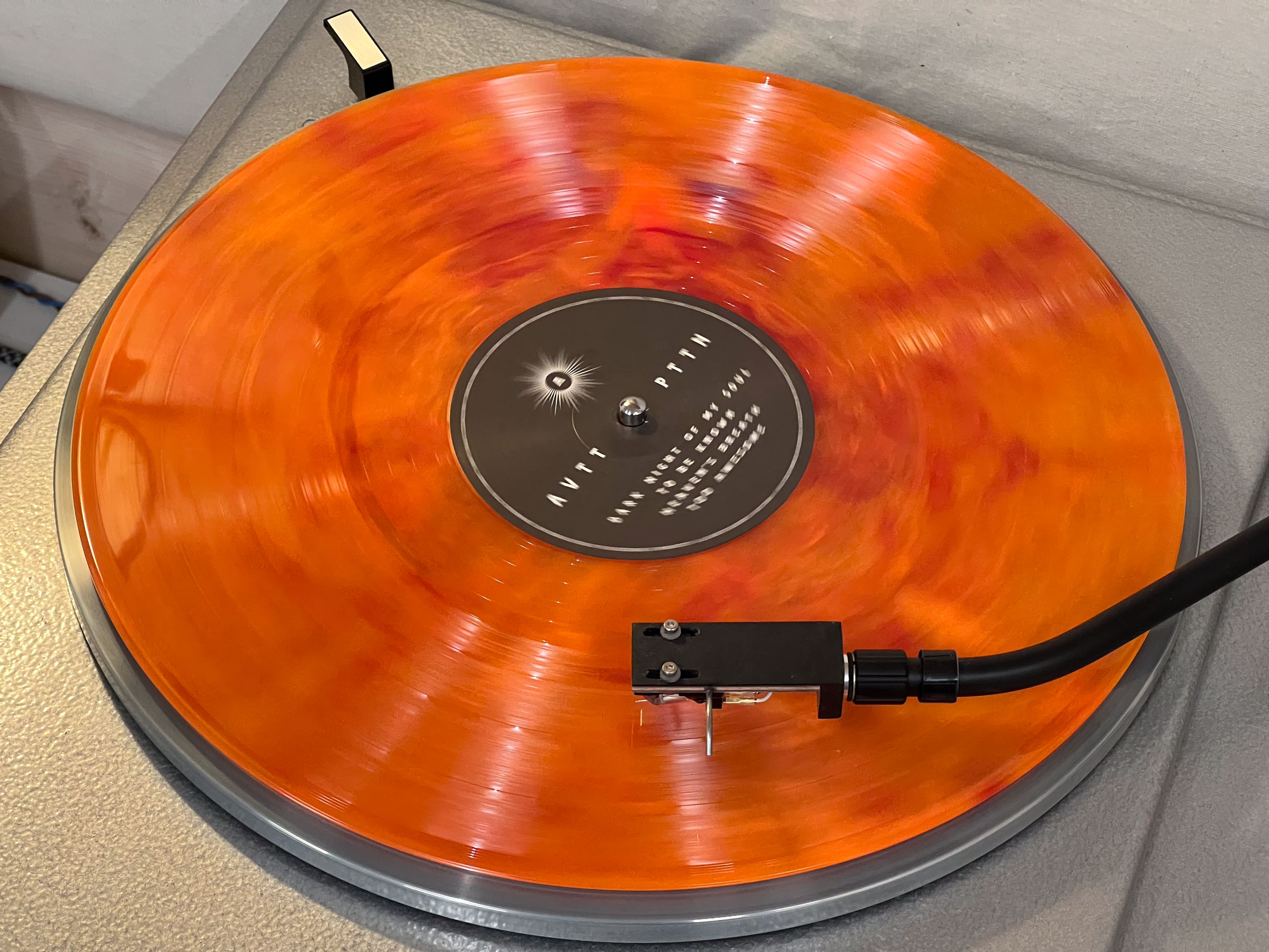
AVTT/PTTN
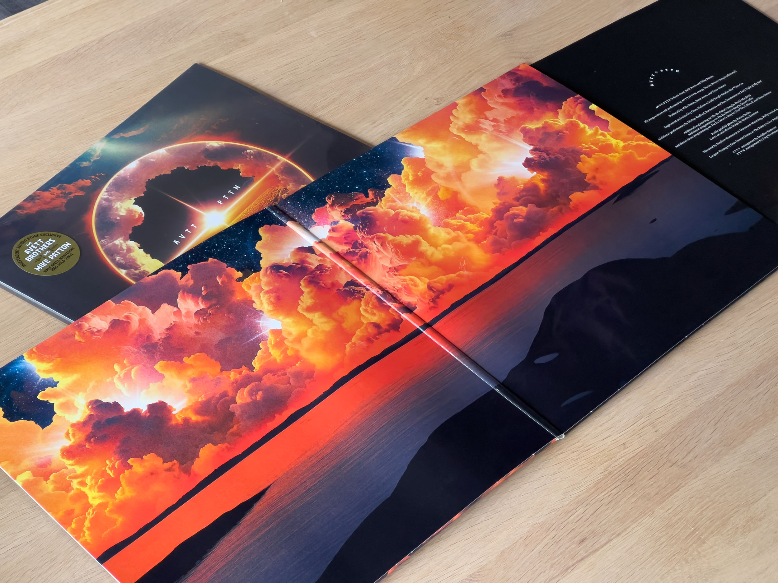
Inside gatefold photo by Halvor Bodin.
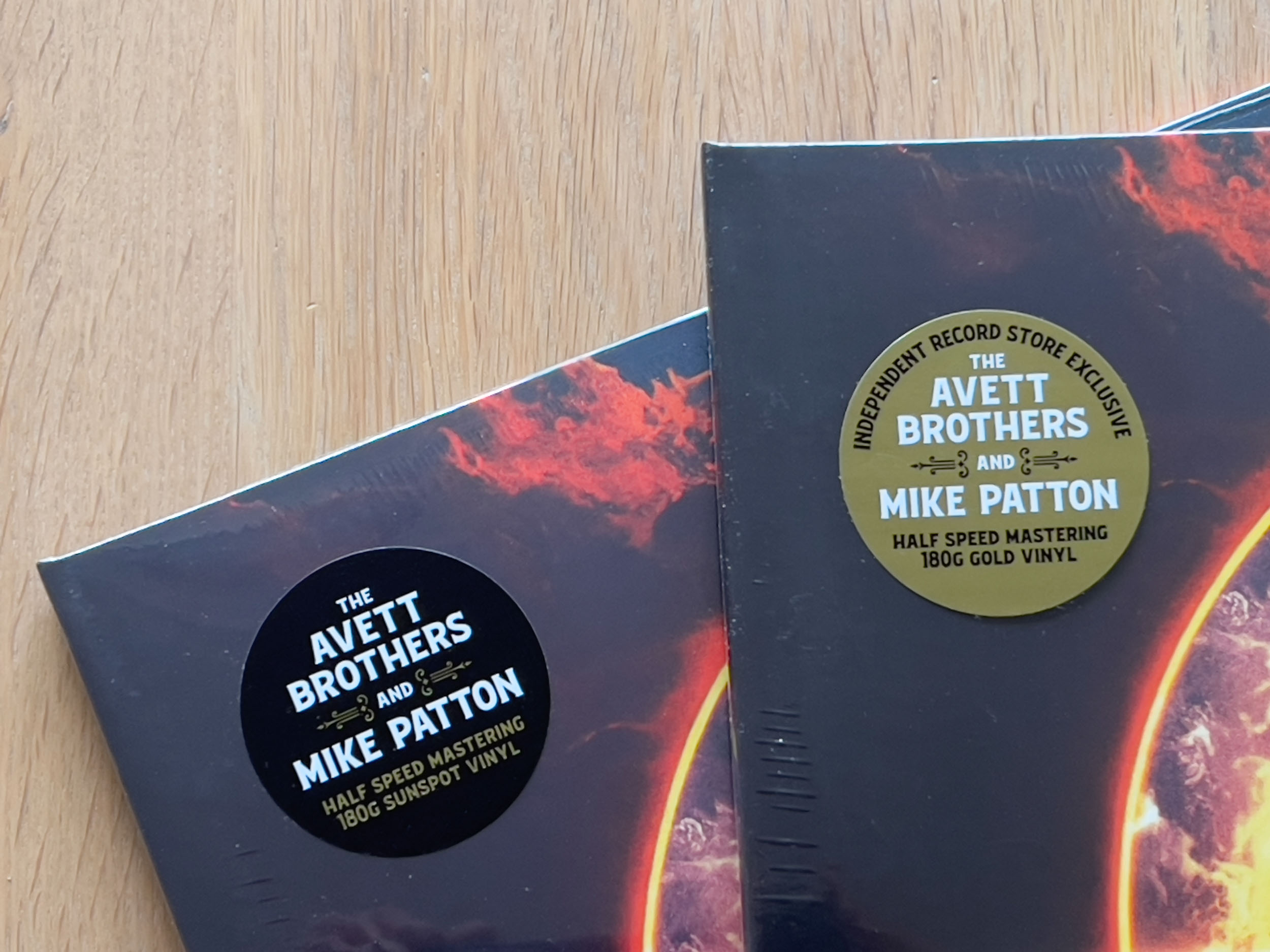
The debut album from AVTT/PTTN, a collaboration between The Avett Brothers and Mike Patton. The album is being released on Thirty Tigers in association with Ipecac Recordings and Ramseur Recordings. The Ipecac Bandcamp store and webstores have an exclusive vinyl variant with alternate artwork.
In 2019, Scott Avett and Mike Patton began communicating after Avett mentioned his admiration of Patton in an interview which caught the eye of Patton's management team. Patton told Avett the door was open for collaboration should Avett ever be interested. A year or so later, Avett sent some song demos to Patton that blew him away. The trading of songs and sounds continued between The Avett Brothers and Mike Patton until several years later, they had a full album of songs—and AVTT/PTTN was born.
AVTT/PTTN is Scott Avett, Seth Avett, and Mike Patton.
All songs written and performed by AVTT/PTTN except Ox Driving Song (traditional. Produced by Mike Patton, Scott Avett, and Dana Nielsen. Engineered and Mixed by Dana Nielsen. Additional performances by Mickey Raphael, harmonica and bass harmonica on Dark Night of My Soul. Additional engineering on Ox Driving Song by David Mayfield; Additional programming on Ox Driving Song by Jason Lader; Additional drum programming on Ox Driving Song by Otto Von Schirach and Dana Nielsen.
Released November 14, 2025
Ipecac RecordingsRamseur Recordings
The Avett Brothers
Mike Patton Bandcamp
Martin Kvamme Instagram
2025
I did the photograph used inside the gatefold on vinyl and CD as well as the backdrop photographs for live TV when AVTT/PTTN played CBS Saturday Sessions 251206. The artwork with photocollages and the cover design is done by Martin Kvamme.
The photographs are from Moutmarka in Færder National Park, Norway where I have lived and worked for the last ten years. Færder National Park is a distinctive archipelago landscape in the outer Oslo Fjord that is the result of the work carried out by the enormous ice masses from the Ice Age.
The pictures are shot close to local well named points of interest Verdens Ende (World’s End) and Faenshølet (Devils/Damn Hole).





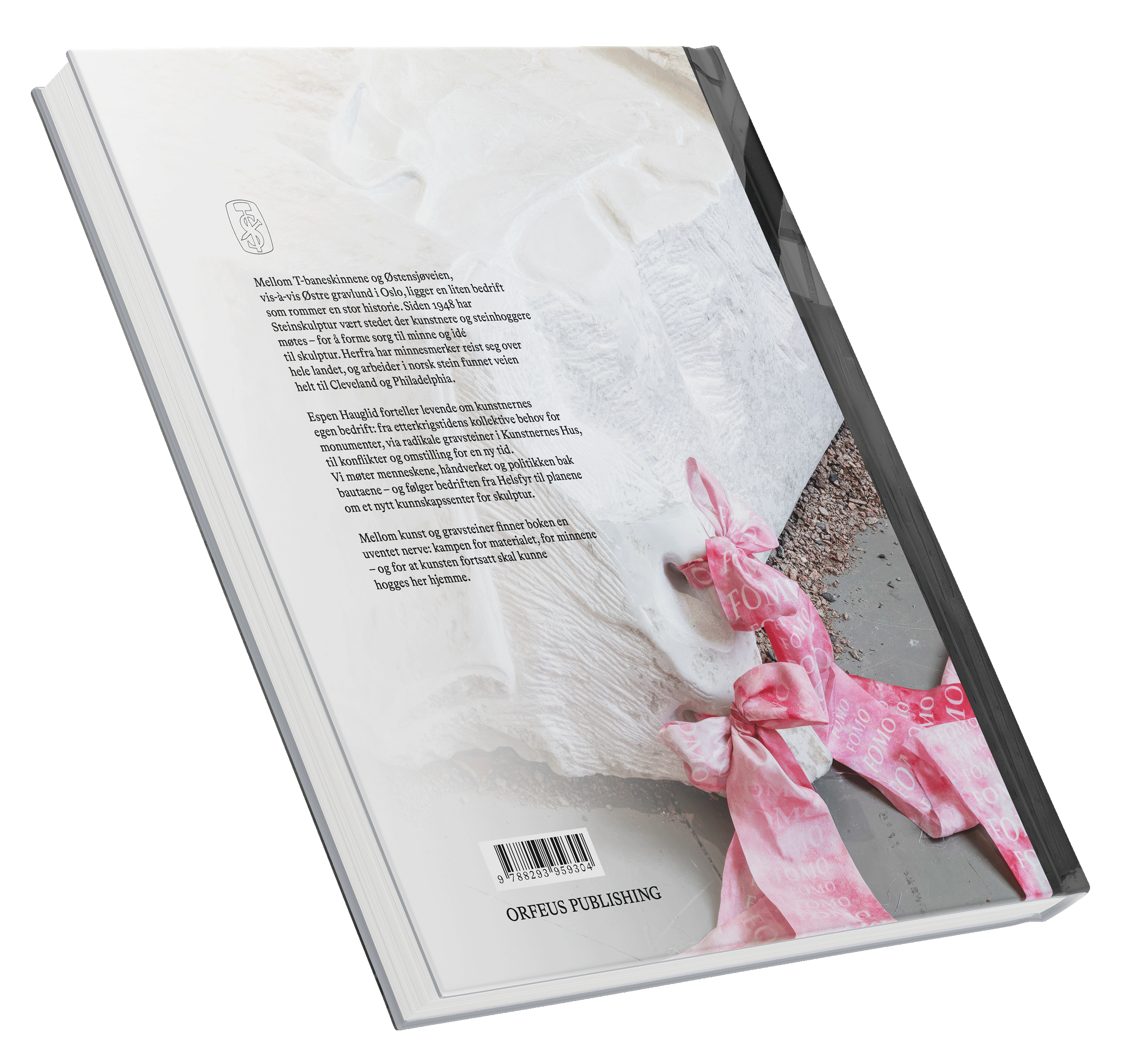
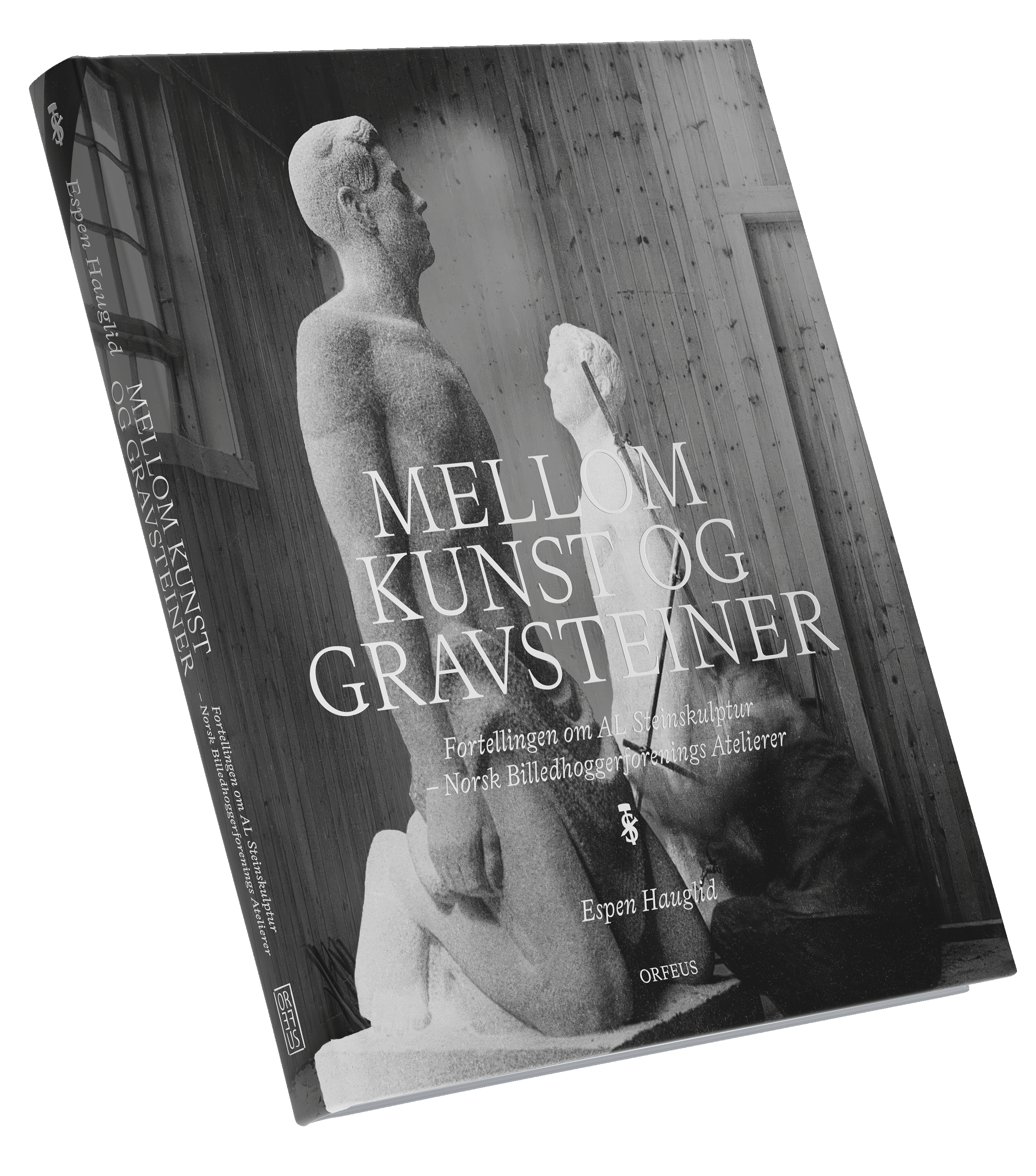
Mellom kunst og gravsteiner
– En fortelling om SA Steinskulptur
Espen Hauglid offers a vivid account of the artists’ own enterprise: from the post-war collective need for monuments, via radical gravestones exhibited at Kunstnernes Hus, to conflicts and restructuring for a new era.
We meet the people, the craft and the politics behind the monoliths – and follow the business from Helsfyr to the plans for a new centre of knowledge for sculpture. Between art and gravestones, the book finds an unexpected tension: the struggle for the material, for the memories – and for ensuring that art can still be carved here at home.
© Orfeus Publishing
Author: Espen Hauglid
Publishing editor: Birgitte M. Siem
The publication was produced in collaboration with SA Steinskulptur.
Design/repro: Halvor Bodin
Orfeus Publishing
View all projects with Orfeus Publishing here.
2025
190 x 230 mm
160 pages
ISBN: 978-82-93959-30-4
Livonia Print SIA, 2025, Latvia
Paper: Amber Graphic 150 g/m²
Book jacket: Geltex 11 LS
Typography: Bradford LL
Language: Norwegian
190 x 230 mm
160 pages
ISBN: 978-82-93959-30-4
Livonia Print SIA, 2025, Latvia
Paper: Amber Graphic 150 g/m²
Book jacket: Geltex 11 LS
Typography: Bradford LL
Language: Norwegian

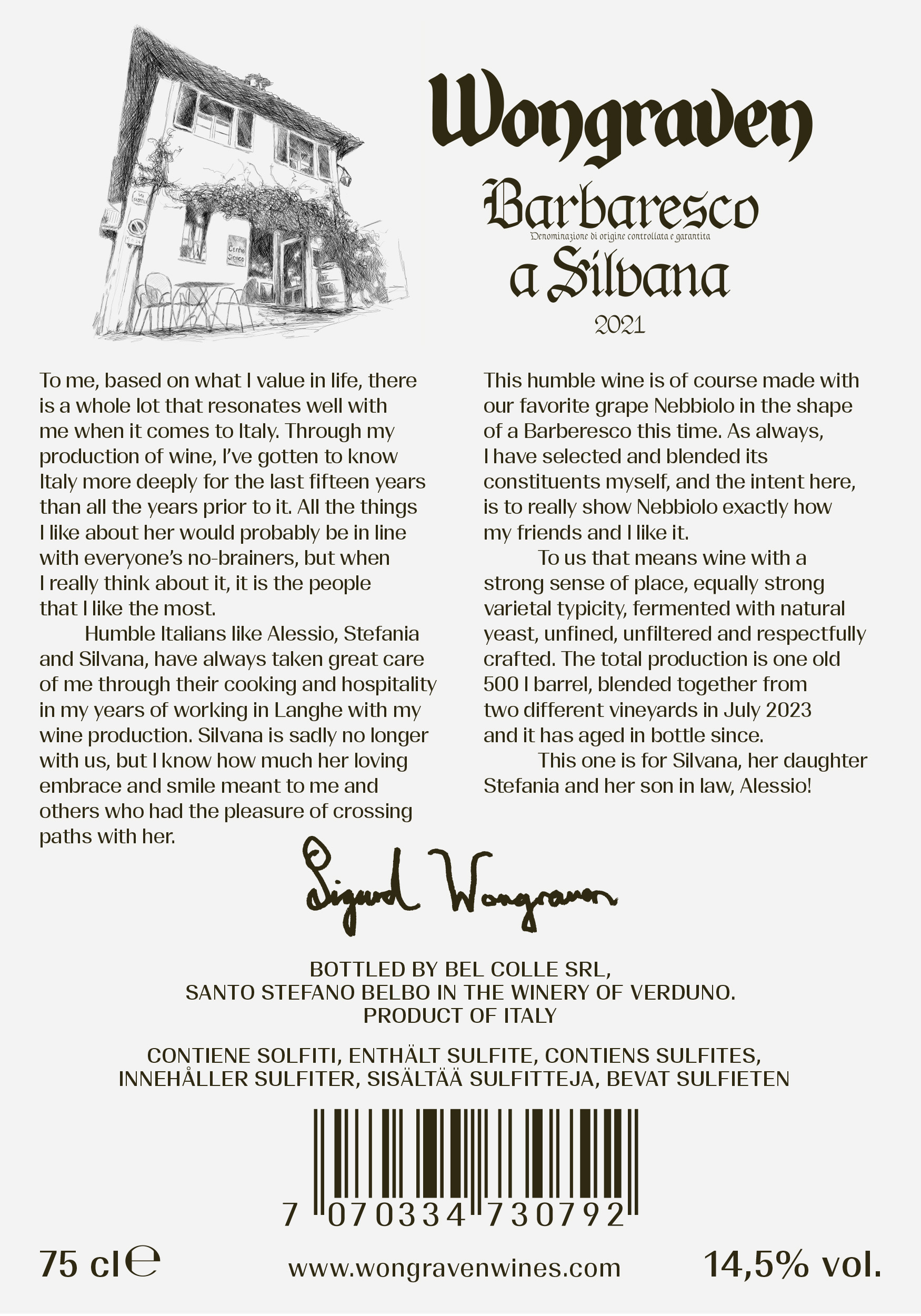

Wongraven Barbaresco a Silvana 2021
Design/drawing: Halvor Bodin
Wongraven Wines
2025
Wine labels for 75 cl/150 cl
Wine labels for 75 cl/150 cl

Per Kirkeby & Fredrik Værslev
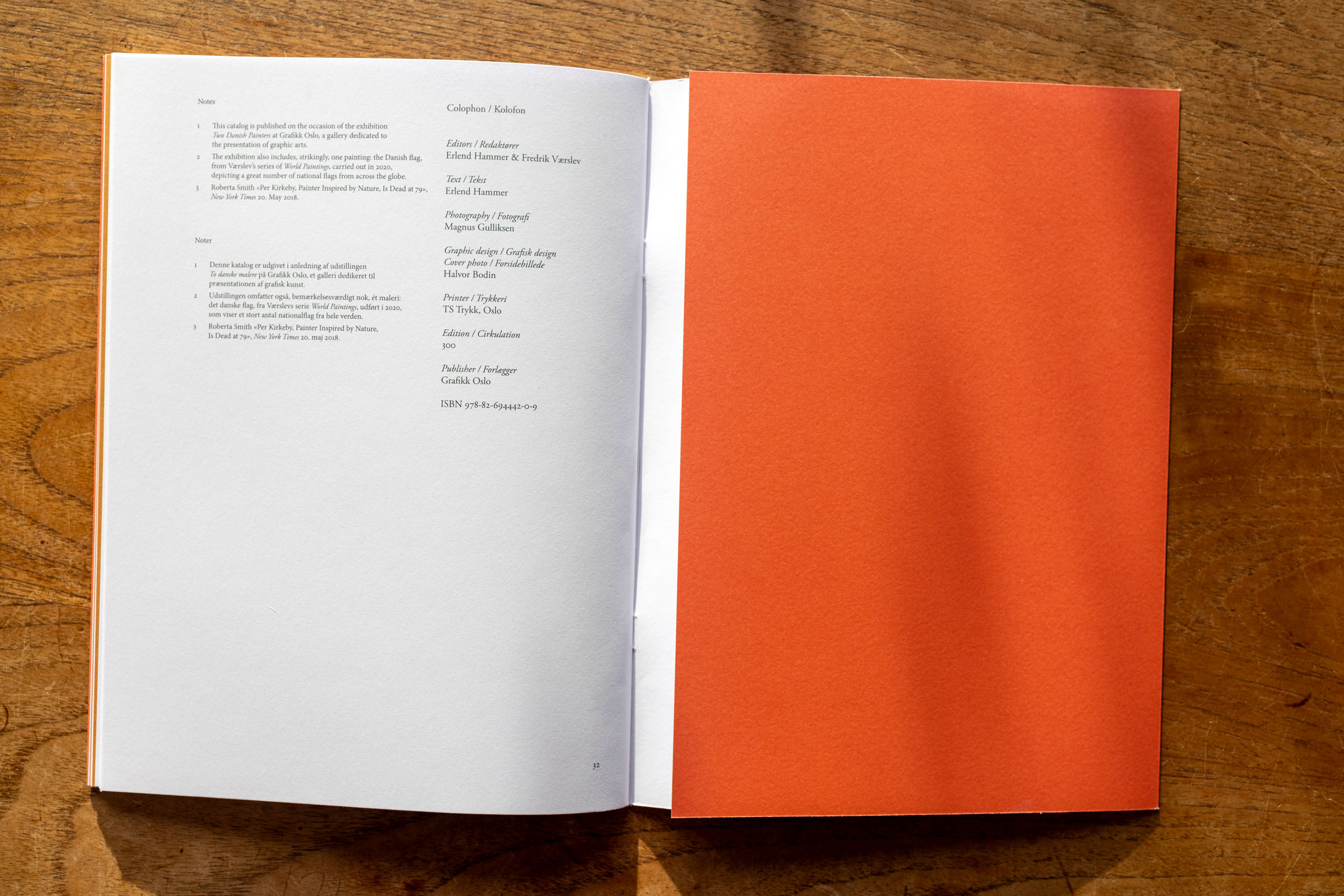
Two Danish Painters at Grafikk Oslo, a gallery dedicated to
the presentation of graphic arts.
Danish Conditions
The “Dane”
First of all, what’s going on with this exhibition title? Two Danish Painters? For much of his life Fredrik Værslev has lived under the impression that he was 1/4th Danish. This would not have been a particularly rare statistic. Norway, after all, was under Danish rule for ages, part of a union with Denmark, from 1380 until 1814, a period of 434 years. During this time much of the country’s public administration was carried out by civil servants who came from Denmark, and of whom many settled down here. Written Norwegian is virtually Danish etc. etc. So, the significance Værslev has placed upon his Danish heritage can easily be characterized as a bit outsized given the fact that it’s something shared by a great number of people. And finally; in preparation for this exhibition, Værslev had a conversation with his aunt which led to the shocking discovery that the artist is in fact, only 1/16th part Danish. He did not have a Danish grandparent, but a great-great grandparent, and was simply extremely bad at math. Throughout the period of preparing for this exhibition, Værslev had spent an inordinate amount of time trying to figure out precisely how Danish he was, and: whether a family story that the entire Værslev clan had once visited their ancestral home together was actually true.
No matter how Danish the artist Fredrik Værslev really is, Værslev is still actually a village in Denmark, so that at least carries some sort of added meaning. The township is in the Western region of Zealand, with a population of 4400 and such little detail is given even by the local tourist board that there seems to be nothing more to say about it. Rumor in the family was that on a collective outing to the village they had all been photographed together in front of the town sign, and not least that whilst this was taking places their cars were robbed, presumably by locals unimpressed by the fact that this group of mountain monkeys (as the head coach of the Danish national football team once famously called Norwegians) were actually Værslev diaspora.
(introduction written by Erlend Hammer)
Editors: Erlend Hammer & Fredrik Værslev
Text: Erlend Hammer
Publisher: Grafikk Oslo
Photography: Magnus Gulliksen
Design/repro/cover photo: Halvor Bodin
Grafikk Oslo
2025
200 x 270 mm
32 pages
ISBN 978-82-694442-0-9
TS Trykk, Oslo
Typography: Adobe Graamond Pro
Language: Danish/English
This catalogue is a conseptually and visually a replica of the Per Kirkeby catalogue Baksteenskulptur / Backstein-Skulptur, Museum Boymans-van Beuningen, Rotterdam, 1987. ISBN 90 6918 017 0. The text and the photos are of course new, but the format, the grid, colours and typography the same.
In the years 1985–1993 famous Dutch graphic designer Wim Crouwel was in fact the director of the Museum Boijmans Van Beuningen. Accurate information on Wim Crouwel at Neugraphic.com.
Wim Crouwel did not design the Kirkeby catalog from 1987, but he for sure had his eyes/mind on it since he wrote the foreword as the museum director. The design was done by Mart Warmerdam and Reynoud Homan.
Personally I had the pleasure of attending a lecture with Wim Crouwel in Oslo (Norsk Form). I have to find out which year it was, around 1997 I think.


